R Basic Plotting system
Overview
Teaching: 5 min
Exercises: 0 minQuestions
How to make a quick and simple plot in R
Objectives
Basic R plot
The Base plotting system
Important BASE graphic parameters
pch: the plotting symbol (default is open circle)
lty: the line type (default is solid line), can be dashed, dotted, etc.
lwd: the line width, specified as an integer multiple
col: the plotting color, specified as a number, string, or hex code; the colors() function gives you a vector of colors by name
xlab: character string for the x-axis label
ylab: character string for the y-axis label
Important BASE plotting function
plot: make a scatterplot, or other type of plot depending on the class of the object being plotted
lines: add lines to a plot, given a vector x values and a corresponding vector of y values (or a 2-column matrix); this function just connects the dots
points: add points to a plot
text: add text labels to a plot using specified x, y coordinates
title: add annotations to x, y axis labels, title, subtitle, outer margin
mtext: add arbitrary text to the margins (inner or outer) of the plot
axis: adding axis ticks/labels
Motor Trend Car Road Tests example
The data was extracted from the 1974 Motor Trend US magazine, and comprises fuel consumption and 10 aspects of automobile design and performance for 32 automobiles (1973–74 models).
- Usage:
data(mtcars)
dim(mtcars)
names(mtcars)
head(mtcars)
print(mtcars)
- Simple Summaries of Data Simple Summaries of Data
Five-number summary
summary(mtcars)Boxplots:
boxplot(mtcars$mpg,col="blue",main="Boxplot for mpg")
factor(mtcars$cyl)
boxplot(mpg~cyl,data=mtcars,
        col=terrain.colors(3),main="MPG by car cylinders",
        xlab = "cylinders",ylab="mpg")
legend("topright",c("4","6","8"),fill = terrain.colors(3))

Histograms
hist(mtcars$hp, col="magenta")

Barplot
barplot(mtcars$mpg,col="green",
        main="MPG for 32 cars")

Scatter plot
plot(mtcars$mpg,mtcars$wt,main="Car Fuel vs Weight",
     xlab="Milage per Gallon",ylab="Weight",
     col = mtcars$cyl,pch=16,cex=3)
legend("topright",legend=c(8,6,4),pch=16,cex=3,
       col=c("grey","magenta","blue"))

Subplot
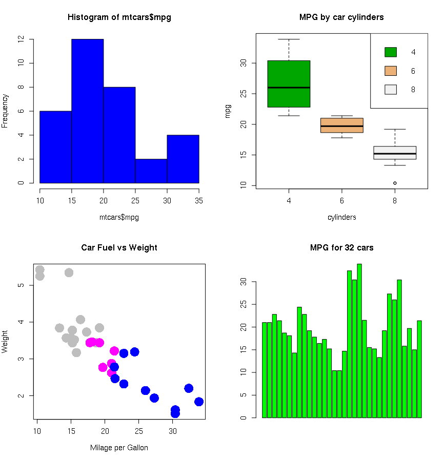
par(mfrow=c(2,2))
hist(mtcars$mpg,col="blue")
boxplot(mpg~cyl,data=mtcars,
        col=terrain.colors(3),main="MPG by car cylinders",
        xlab = "cylinders",ylab="mpg")
legend("topright",c("4","6","8"),fill = terrain.colors(3))

plot(mtcars$mpg,mtcars$wt,main="Car Fuel vs Weight",
     xlab="Milage per Gallon",ylab="Weight",
     col = mtcars$cyl,pch=16,cex=3)
barplot(mtcars$mpg,col="green",
        main="MPG for 32 cars")
Graphics Devices
A graphics device is something where you can make a plot appear When you make a plot in R, it has to be “sent” to a specific graphics device.
- A window on your computer (screen device): quick visualization
- A PDF, PNG, JPEG file (file device) #recommended for documents, paper, presentation
The most common place for a plot to be “sent” is the screen device
- On a Mac the screen device is launched with the quartz()
- On Windows the screen device is launched with windows()
- On Unix/Linux the screen device is launched with x11()
- save graphic to PDF
- save graphic to PNG, JPEG
dev.copy(png,"filename.png") # to save the image to file
dev.off() # to close all the graphical devices
Key Points