Heatmap
Overview
Teaching: 10 min
Exercises: 0 minQuestions
Objectives
Let’s load some time series data from previous example using Jena Climate
import pandas as pd
df = pd.read_csv('https://raw.githubusercontent.com/vuminhtue/SMU_Python_Visualization/master/data/jena_climate_2009_2016.csv')
# Convert the date column from string to datetime type
df["date"] = pd.to_datetime(df["Date Time"])
df["month"] = df["date"].dt.month
df["year"]  = df["date"].dt.year
df.head()
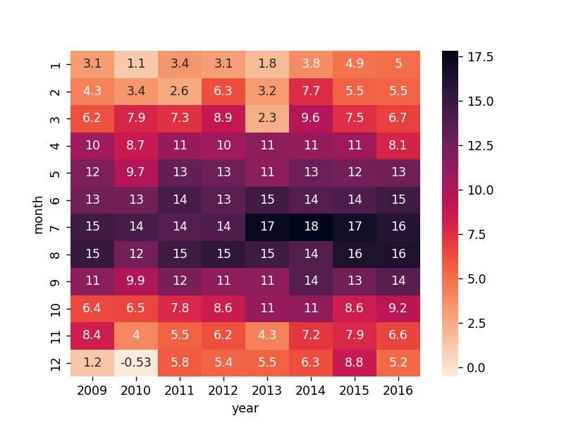
Create aggregated data (mean monhtly Temperature):
df1 = df.groupby(['year','month'])['T (degC)'].mean().reset_index()
Then make a pivot table
df1 = df1.pivot("month","year","T (degC)")
#Drop the last year (nan value)
df1 = df1.drop(2017,axis=1)
Plot heatmap
sns.heatmap(df1,annot=True,cmap="rocket_r")
Key Points
Heatmap, Seaborn