Line plot
Overview
Teaching: 20 min
Exercises: 0 minQuestions
Objectives
Let’s load some time series data
import pandas as pd
df = pd.read_csv('https://raw.githubusercontent.com/vuminhtue/SMU_Python_Visualization/master/data/us.csv')
# Convert the date column from string to datetime type
df["date"] = pd.to_datetime(df["date"])
df.head()
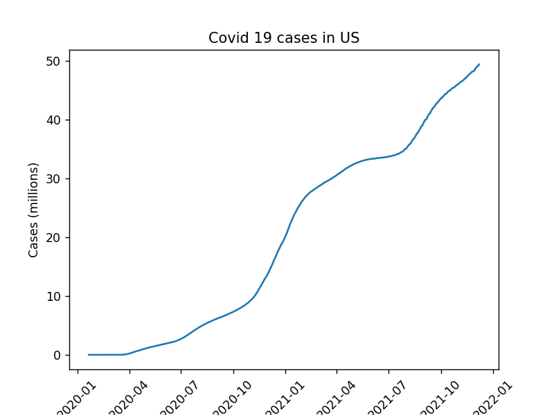
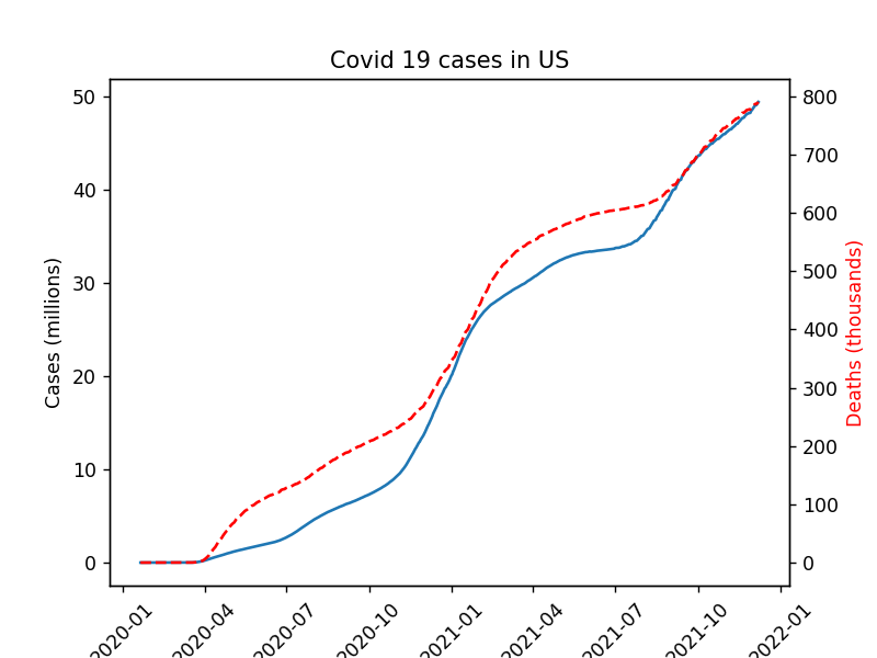
We have loaded covid 19 cases in US for 2020 and 2021. The first column contains the date while second and third are positive cases and number of deaths from Covid19
Using Matplotlib
%matplotlib notebook
plt.plot(df["date"],df["cases"]/10**6)
plt.title("Covid 19 cases in US")
plt.xlabel("Time")
plt.ylabel("Cases (millions)")
plt.xticks(rotation=45)
Using 2 different axes:
%matplotlib notebook

fig, ax1 = plt.subplots()

ax1.plot(df["date"],df["cases"]/10**6)
ax1.set_title("Covid 19 cases in US")
ax1.set_xlabel("Time")
ax1.set_ylabel("Cases (millions)")
plt.xticks(rotation=45)

ax2 = ax1.twinx()
ax2.plot(df["date"],df["deaths"]/10**3,color="red",linestyle="dashed")
ax2.set_ylabel("Deaths (thousands)",color="red")
Using Seasborn
The above data is some how very simple (2 year) so it would be easy to be demonstrated by simple Matplotlib pyplot. However, for longer data like Jena Climate data (Kaggle), it would be more useful to use Seaborn for aggregated plotting
Load Jena Climate data:
df = pd.read_csv("https://raw.githubusercontent.com/vuminhtue/SMU_Python_Visualization/master/data/jena_climate_2009_2016.csv")
df["date"] = pd.to_datetime(df["Date Time"])
df["month"] = df["date"].dt.month
df["year"]  = df["date"].dt.year
df.head(
Plotting with 1 y-axis
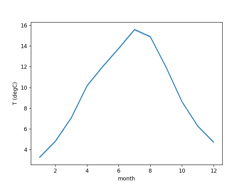
Plot the monthly average temperature data across entire period (8 years), the middle continuos line is the mean while the shaded represent 25-75 percentile range of the daily data of the month
%matplotlib notebook
sns.lineplot("month","T (degC)", data=df)
Plotting with 2 y-axes
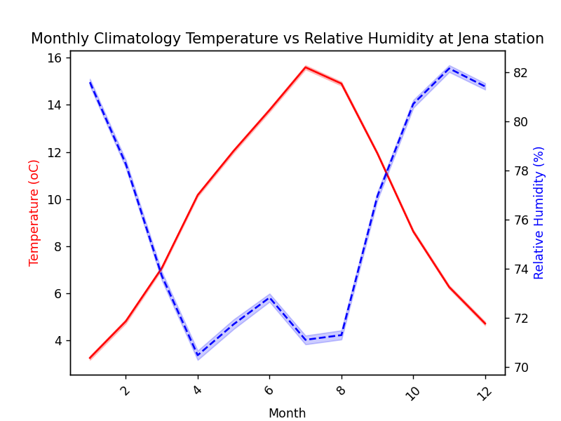
It is very similar to the previous example for 2 y-axes plotting
%matplotlib notebook

fig, ax1 = plt.subplots()

ax1 = sns.lineplot(df["month"],df["T (degC)"],color="red",data=df)
ax1.set_title("Monthly Climatology Temperature vs Relative Humidity at Jena station")
ax1.set_xlabel("Month")
ax1.set_ylabel("Temperature (oC)",color="red")
plt.xticks(rotation=45)


ax2 = ax1.twinx()
ax2 = sns.lineplot(df["month"],df["rh (%)"],color="blue",linestyle="dashed")
ax2.set_ylabel("Relative Humidity (%)",color='blue')
Key Points
Line plot