Histogram plot
Overview
Teaching: 20 min
Exercises: 0 minQuestions
What is Histogram plot
Objectives
Learn how to plot histogram using Matplotlib and Seaborn
Using Matplotlib
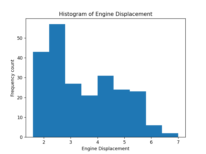
Let continue with a histogram plot with the xaxis is Engine Displacement value and the bin value equals to 9.
%matplotlib notebook
plt.hist(df['displ'],bins=9)
plt.title("Histogram of Engine Displacement")
plt.xlabel("Engine Displacement")
plt.ylabel("Frequency count")
Using Seaborn
%matplotlib notebook
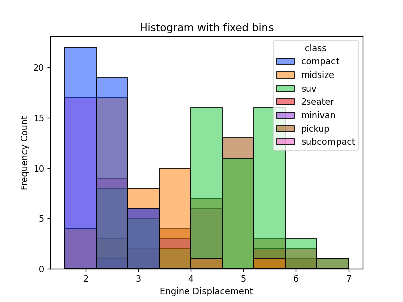
ax = sns.histplot(x="displ", bins=9, hue="class", data=df,palette = "bright")
ax.set(xlabel='Engine Displacement',
       ylabel='Frequency Count',
       title='Histogram with fixed bins')
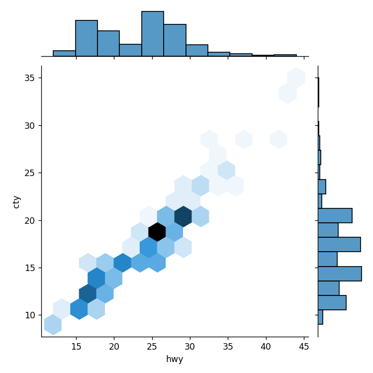
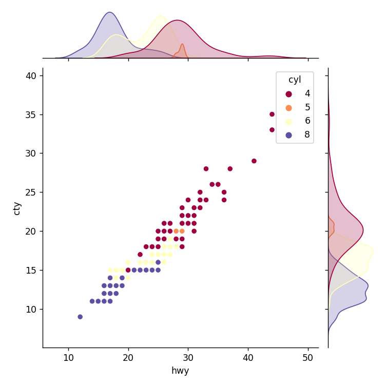
Plotting 2 different historgram plot using seaborn.jointplot
Here we will plot the distribution of fuel consumption for Highway and City then plot the scatter plot between them:
sns.jointplot("hwy", "cty",data=df, kind="hex")
ax = sns.jointplot("hwy", "cty",hue="cyl",data=df,palette="Spectral")
Key Points
histogram