Line plot
Overview
Teaching: 20 min
Exercises: 0 minQuestions
Objectives
Let’s load some time series data
data = read.csv('https://raw.githubusercontent.com/vuminhtue/SMU_Python_Visualization/master/data/us.csv')
Convert string to datetime
data$date = as.POSIXct(data$date, format="%Y-%m-%d")
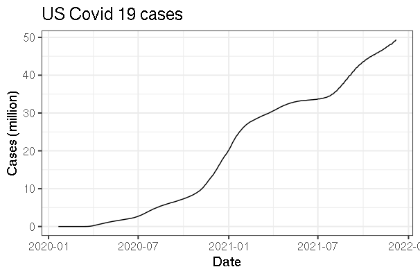
We have loaded covid 19 cases in US for 2020 and 2021. The first column contains the date while second and third are positive cases and number of deaths from Covid19
Line plot for 1 y axis
gp <- ggplot(data, aes(date, cases/10^6))
gp+geom_line()+
  xlab("Date")+
  ylab("Cases (million)")+
  ggtitle("US Covid 19 cases")+
  theme_bw(base_size = 15)
Line plot side by side
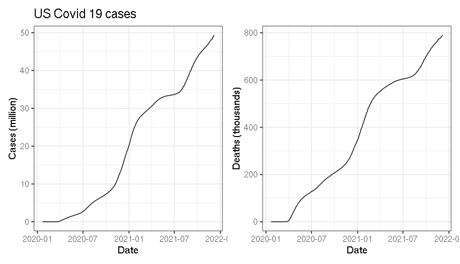
```rgp <- ggplot(data, aes(date, cases/10^6)) p1 <- gp+geom_line()+ xlab(“Date”)+ ylab(“Cases (million)”)+ ggtitle(“US Covid 19 cases”)+ theme_bw(base_size = 15)
gp <- ggplot(data,aes(date)) p1 <- gp + geom_line(aes(y=cases/10^6))+ xlab(“Date”)+ ylab(“Cases (million)”)+ ggtitle(“US Covid 19 cases”)+ theme_bw(base_size = 15)
p2 <- gp + geom_line(aes(y=deaths/10^3))+ xlab(“Date”)+ ylab(“Deaths (thousands)”)+ theme_bw(base_size = 15)
library(patchwork) # Thanks to this library p1+p2
## Line plot with 2 axes:
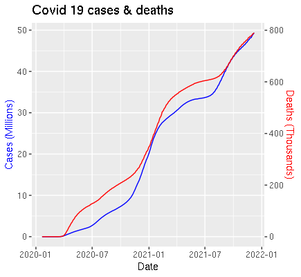
Line plot with 2 axes in ggplot 2 is a little bit tricky.
Here, we apply the function **scale_y_continuous**, which scale the secondary y-axis to the same as first y-axis.
The tricky part is to define the coefficient value so that the 2 y-axes can be in the same scale.
```r
# First I convert the cases to million and deaths to thousand unit:
cases_mil= data$cases/10^6
deaths_thous = data$deaths/10^3
# Define the coefficient between 2 y-axes:
coef = max(cases_mil)/max(deaths_thous)
gp <- ggplot(data)
gp + geom_line(aes(date,cases_mil),color="blue")+
geom_line(aes(date,deaths_thous*coef),color="red")+
scale_y_continuous(name="Cases (Millions)",
sec.axis = sec_axis(~./coef,
name="Deaths (Thousands)"))+
xlab("Date")+
ggtitle("Covid 19 cases & deaths")+
theme(axis.title.y.left=element_text(colour="blue"),
axis.title.y.right=element_text(colour="red"))
Key Points
Line plot