Heatmap
Overview
Teaching: 10 min
Exercises: 0 minQuestions
Objectives
Let’s load some time series data from previous example using Jena Climate
data = read.csv('https://raw.githubusercontent.com/vuminhtue/SMU_Python_Visualization/master/data/jena_climate_2009_2016.csv',header = TRUE)
data["date"] = as.POSIXct(data$Date.Time, format="%m.%d.%Y %H:%M:%S")

# Create 2 new columns month and year for data
library(lubridate)
data["month"]=month(data$date)
data["year"]=year(data$date)
Create aggregated data (mean monhtly Temperature):
data1 = aggregate(data$T..degC.,by=list(data$year,data$month),FUN=mean)
colnames(data1)=c("Year","Month","T")
Remove 2017
ind <- data1$Year==2017
data1[ind,]=NaN
Plot heatmap
ggplot(data1,aes(Year,Month,fill=T))+
  geom_tile()+
  scale_fill_distiller(palette = "RdPu")
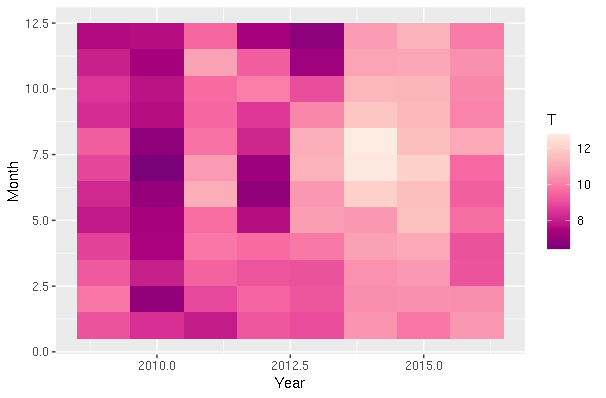
Key Points
Heatmap, Seaborn