Scatter plot
Overview
Teaching: 20 min
Exercises: 0 minQuestions
Objectives
Learn how to plot a nice scatter plot in matplotlib
Scatter plot
Syntax
plt.scatter(X, Y)
Let’s load some dataset and we will start PLOTTING !!!
Using Matplotlib
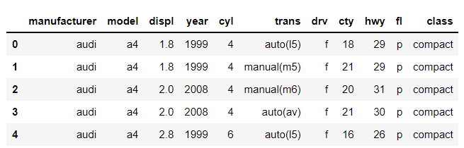
Here are the fuel consumption for different type of cars in miles per gallon (mpg)
import pandas as pd
df = pd.read_csv('https://raw.githubusercontent.com/vuminhtue/SMU_Python_Visualization/master/data/mpg.csv')
df.head()
Now let’s move on to other type of plot
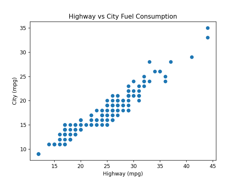
Plot a scatter plot with X axis for Highway (hwy) and Y axis for City (cty) mpg
%matplotlib notebook
plt.scatter(df["hwy"],df["cty"])
plt.title("Highway vs City Fuel Consumption")
plt.xlabel('Highway (mpg)')
plt.ylabel('City (mpg)')
We can also control the color “c”, size “s” and marker using the following syntax:
plt.scatter(df["hwy"],df["cty"],c="green",s=20,marker="s")
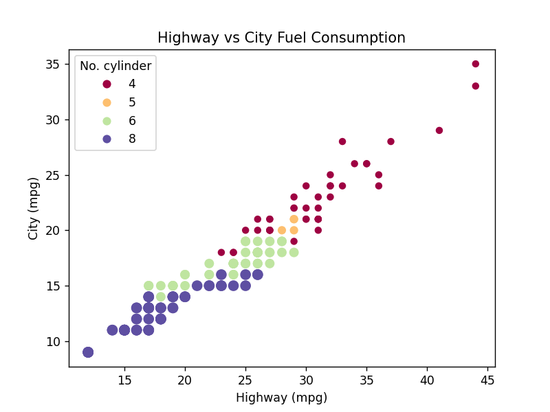
If we want to have a more detailed scatter plot, we introduce the color layer and corresponding legend:
%matplotlib notebook
# Sort data by column:
df1 = df.sort_values(by='cyl')

# Compute factor of cylinder data:
C = df1["cyl"].factorize()

# Start ploting with scatter plot:
s = plt.scatter(df1["hwy"],df1["cty"],c=C[0],s=(C[0]+5)**2,cmap="Spectral")

# Ploting annotation & legend:
plt.legend(s.legend_elements()[0],C[1],title="No. cylinder")
plt.title("Highway vs City Fuel Consumption")
plt.xlabel('Highway (mpg)')
plt.ylabel('City (mpg)')
plt.show()
Using seaborn
%matplotlib notebook
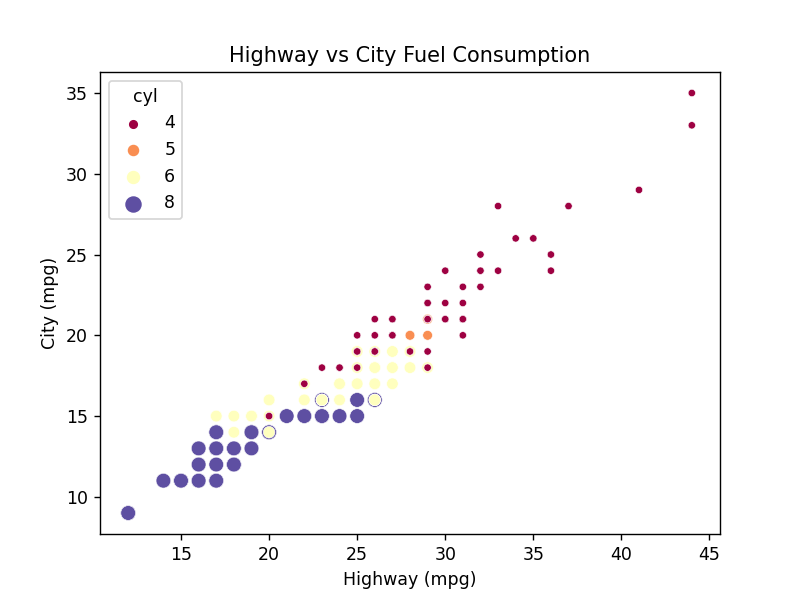
ax = sns.scatterplot(x="hwy",y="cty",hue="cyl",size="cyl",data=df,palette="Spectral")
ax.set(xlabel='Highway (mpg)',
       ylabel='City (mpg)',
       title='Highway vs City Fuel Consumption')
Linear modeling plot using seaborn
%matplotlib notebook
ax = sns.lmplot(x="hwy",y="cty",hue="cyl", markers=["o", "x","s","*"],data=df)
ax.set(xlabel='Highway (mpg)',
       ylabel='City (mpg)',
       title='Highway vs City Fuel Consumption')
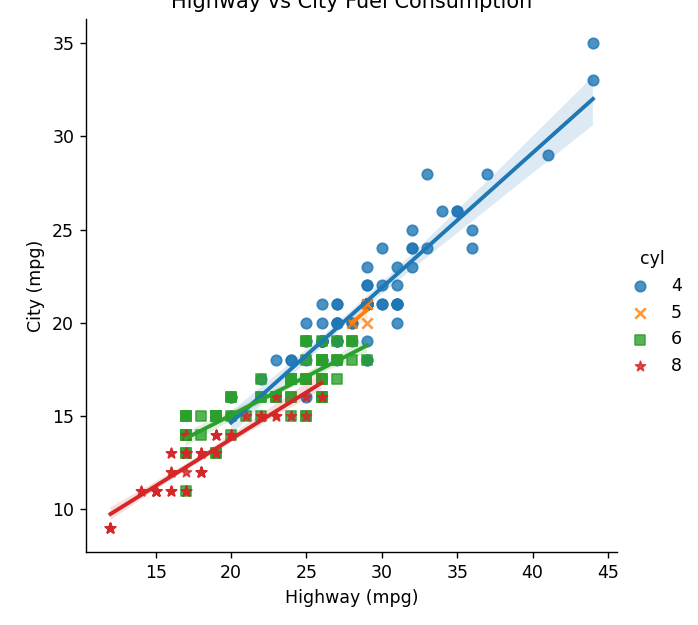
More information on using seaborn with scatter plot can be found here
Key Points
matplotlib, scatter plot