Introduction to Geospatial Anaytics using Python
Overview
Teaching: 10 min
Exercises: 0 minQuestions
What is Geospatial Analytics
Objectives
Learn to use Python for Geospatial Analytics
Here we use the tutorial from “Use Data for Earth and Environmental Science in Open Source Python”, a lecture from Earth Lab at CU Boulder.
To better fit the content within 2 hours- workshop, we assume participants are familiar with GIS data like vector shapefile and raster data and basic Python command
The workshop is run using M2 via HPC OpenOnDemand with the conda environment setup. Please refer to the setup task to create the conda environment and Jupyter Kernels before the workshop.
Following Python library are needed:
- xarray
- rioxarray
- earthpy
- matplotlib
Following data is used: Colorado river data.
Let’s get started.
Key Points
Python, Geospatial Analytics
Introduction to Spatial Vector data
Overview
Teaching: 20 min
Exercises: 0 minQuestions
What is Geospatial Vector data
Objectives
Describe the characteristics of 3 key vector data structures: points, lines and polygons.
Open a shapefile in Python using geopandas - gpd.read_file().
View the CRS and other spatial metadata of a vector spatial layer in Python
Access and view the attributes of a vector spatial layer in Python.
2.1 Geospatial Vector data
Vector data
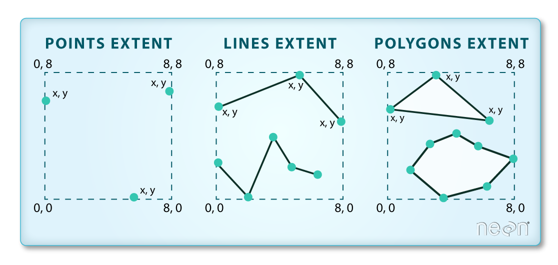
Vector data are composed of discrete geometric locations (x, y values) known as vertices that define the “shape” of the spatial object. The organization of the vertices determines the type of vector that you are working with. There are three types of vector data:
-
Points: Each individual point is defined by a single x, y coordinate. There can be many points in a vector point file. Examples of point data include: sampling locations, the location of individual trees or the location of plots.
-
Lines: Lines are composed of many (at least 2) vertices, or points, that are connected. For instance, a road or a stream may be represented by a line. This line is composed of a series of segments, each “bend” in the road or stream represents a vertex that has defined x, y location.
-
Polygons: A polygon consists of 3 or more vertices that are connected and “closed”. Thus the outlines of plot boundaries, lakes, oceans, and states or countries are often represented by polygons. Occasionally, a polygon can have a hole in the middle of it (like a doughnut), this is something to be aware of but not an issue you will deal with in this tutorial.
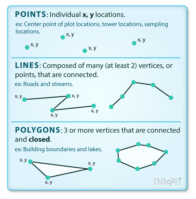
Shapefiles
-
Geospatial data in vector format are often stored in a shapefile_ format. Because the structure of points, lines, and polygons are different, each individual shapefile can only contain one vector type (all points, all lines or all polygons). You will not find a mixture of point, line and polygon objects in a single shapefile.
-
Objects stored in a shapefile often have a set of associated attributes that describe the data. For example, a line shapefile that contains the locations of streams, might contain the associated stream name, stream “order” and other information about each stream line object.
Shapefile structures
- A shapefile is created by 3 or more files, all of which must retain the same NAME and be stored in the same file directory, in order for you to be able to work with them.
- There are 3 key files associated with any and all shapefiles:
.shp: the file that contains the geometry for all features.
.shx: the file that indexes the geometry.
.dbf: the file that stores feature attributes in a tabular format.
Sometimes, a shapefile will have other associated files including:
.prj: the file that contains information on projection format including the coordinate system and projection information. It is a plain text file describing the projection using well-known text (WKT) format.
.sbn and .sbx: the files that are a spatial index of the features.
.shp.xml: the file that is the geospatial metadata in XML format, (e.g. ISO 19115 or XML format).
Data Management - Sharing Shapefiles
When you work with a shapefile, you must keep all of the key associated file types together. And when you share a shapefile with a colleague, it is important to zip up all of these files into one package before you send it to them!
2.2 Working with Shapefile using Python
Download Shapefiles
You will use the geopandas library to work with vector data in Python. You will also use matplotlib.pyplot to plot your data.
First import library and download data:
# Import packages
import os
import matplotlib.pyplot as plt
import geopandas as gpd
import earthpy as et

# Get data and set working directory
data = et.data.get_data('spatial-vector-lidar')
os.chdir(os.path.join(et.io.HOME, 'earth-analytics'))
The data is downloaded to your home directory:
$HOME/earth-analytics/data/spatial-vector-lidar/
Open and Read shapefiles
The shapefiles that you will import are:
- A polygon shapefile representing our field site boundary,
- A line shapefile representing roads, and
- A point shapefile representing the location of field sites at the San Joachin field site.
The first shapefile that you will open contains the point locations of plots where trees have been measured. To import shapefiles you use the geopandas function read_file(). Notice that you call the read_file() function using _gpd.read_file() _to tell python to look for the function within the geopandas library.
# Define path to file
path1 = "data/spatial-vector-lidar/california/neon-sjer-site/vector_data/"

# Import shapefile using geopandas
sjer_locations = gpd.read_file(path1+"SJER_plot_centroids.shp")
Spatial Data Attributes
Each object in a shapefile has one or more attributes associated with it. Shapefile attributes are similar to fields or columns in a spreadsheet. Each row in the spreadsheet has a set of columns associated with it that describe the row element. In the case of a shapefile, each row represents a spatial object - for example, a road, represented as a line in a line shapefile, will have one “row” of attributes associated with it. These attributes can include different types of information that describe objects stored within a shapefile. Thus, our road, may have a name, length, number of lanes, speed limit, type of road and other attributes stored with it.
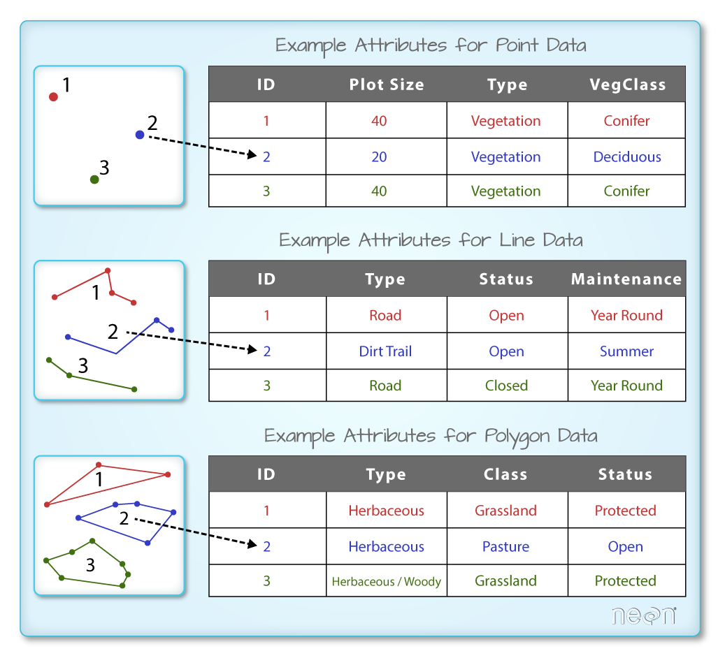
You can use the .head(3) function to only display the first 3 rows of the attribute table. The number in the .head() function represents the total number of rows that will be returned by the function.
sjer_locations.head(3)
In this case, you have several attributes associated with our points including:
sjer_locations.columns
Spatial Metadata
Key metadata for all shapefiles include:
- Object Type: the class of the imported object.
sjer_locations.geom_type
- Coordinate Reference System (CRS): the projection of the data.
sjer_locations.crs
- Extent: the spatial extent (geographic area that the shapefile covers) of the shapefile. Note that the spatial extent for a shapefile represents the extent for ALL spatial objects in the shapefile.
sjer_locations.total_bounds
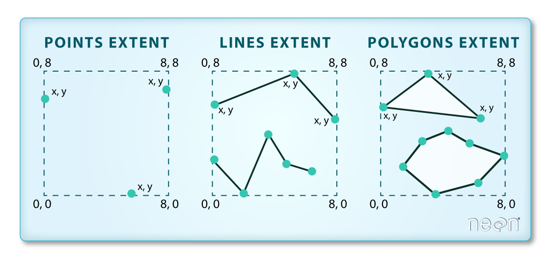 (The spatial extent of a shapefile or geopandas GeoDataFrame represents the geographic “edge” or location that is the furthest north, south east and west. Thus is represents the overall geographic coverage of the spatial object)
How many features in your Shapefiles?
You can view the number of features (counted by the number of rows in the attribute table) and feature attributes (number of columns) in our data using the pandas .shape method. Note that the data are returned as a vector of two values:
sjer_locations.shape
2.3. Plot a point Shapefile
Quick plotting
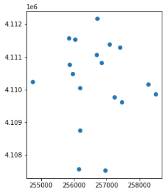
Next, you can visualize the data in your Python geodataframe object using the .plot() method. Notice that you can create a plot using the geopandas base plotting using the syntax:
sjer_locations.plot()
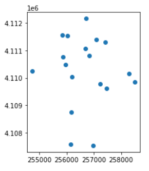
Plotting in axis object
However in general it is good practice to setup an axis object so you can plot different layers together (similar to subplot). When you do that you need to provide the plot function with the axis object that you want it to plot on.
You then plot the data and provide the ax= argument with the ax object.
fig, ax = plt.subplots(figsize=(5, 5))

# Plot the data using geopandas .plot() method
sjer_locations.plot(ax=ax)

plt.show()
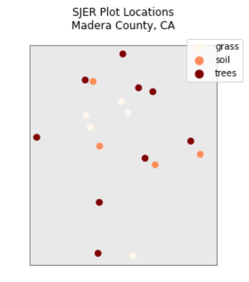
Changing colormap, marker,
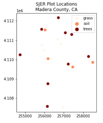
You can plot the data by feature attribute and add a legend too. Below you add the following plot arguments to your geopandas plot:
- column: the attribute column that you want to plot your data using
- categorical=True: set the plot to plot categorical data - in this case plot types.
- legend: add a legend
- markersize: increase or decrease the size of the points or markers rendered on the plot
- cmap: set the colors used to plot the data
- title add a title to your plot.
and fig size if you want to specify the size of the output plot.
fig, ax = plt.subplots(figsize=(5, 5))

sjer_plot_locations.plot(column='plot_type',
                         categorical=True,
                         marker='*',
                         markersize=45,
                         cmap='OrRd',
                         legend=True,
                         ax=ax)


ax.set_title('SJER Plot Locations\nMadera County, CA')

plt.show()
2.4
2.5 Ploting Polygon shapefiles
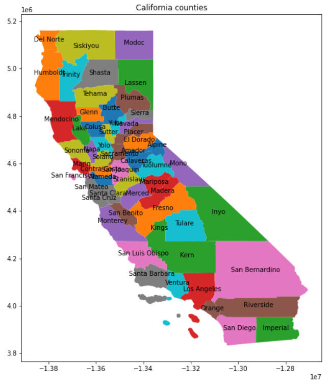
Here we plot different counties in California
# Define path to file
path2 = "data/spatial-vector-lidar/california/CA_Counties/"

# Import shapefile using geopandas
CA_Counties = gpd.read_file(path2+"CA_Counties_TIGER2016.shp")
CA_Counties.head()
Let’s plot county by name with text label
# Create coords column from geometry column
CA_Counties['coords'] = CA_Counties['geometry'].apply(lambda x: x.representative_point().coords[:])
CA_Counties['coords'] = [coords[0] for coords in CA_Counties['coords']]

# Plot 2D plot
fig,ax = plt.subplots(figsize=(10,10))
CA_Counties.plot(column="NAME",ax=ax)
ax.set(title="California counties")

for idx, row in CA_Counties.iterrows():
    plt.annotate(text=row['NAME'], xy=row['coords'],
                 horizontalalignment='center')
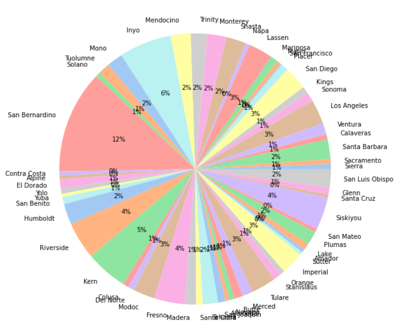
We create a new column name ATotal(%) which the total counties area in percentage vs the whole CA State
Total_Land = CA_Counties['ALAND'].sum()+CA_Counties['AWATER'].sum()
CA_Counties['ATotal(%)']=(CA_Counties['ALAND']+CA_Counties['AWATER'])/Total_Land*100
Then plot it in Pie Chart:
Plot CA Counties
fig,ax = plt.subplots(figsize=(10,10))

#create pie chart
colors = sns.color_palette('pastel')[0:100]

plt.pie(CA_Counties["ATotal(%)"], labels = CA_Counties["NAME"], colors = colors, autopct='%.0f%%')
plt.show()
2.6 Plot Multiple Shapefiles Together With Geopandas
You can plot several layers on top of each other using the geopandas .plot method. To do this, you:
- Define the ax variable just as you did above to add a title to our plot.
- Add as many layers to the plot as you want using geopandas .plot() method.
Notice below
- ax.set_axis_off() is used to turn off the x and y axis and
- plt.axis(‘equal’) is used to ensure the x and y axis are uniformly spaced.
# Import crop boundary using geopandas
sjer_crop_extent = gpd.read_file(path1+"SJER_crop.shp")

# Now plot these 2 shapefiles using the same axis
fig, ax = plt.subplots(figsize=(5, 5))

# First setup the plot using the crop_extent layer as the base layer
sjer_crop_extent.plot(color='lightgrey',
                      edgecolor='black',
                      alpha=.5,
                      ax=ax)

# Add another layer using the same ax
sjer_locations.plot(column='plot_type',
                         categorical=True,
                         marker='o',
                         markersize=45,
                         cmap='OrRd',
                         legend=True,
                         ax=ax)

# Clean up axes
ax.set_title('SJER Plot Locations\nMadera County, CA')
ax.set_axis_off()

plt.axis('equal')
plt.show()
Key Points
earthpy, shapefile, XML, GeoJSON
Introduction to Raster data in Python
Overview
Teaching: 20 min
Exercises: 0 minQuestions
What is Raster data format
Objectives
Open raster data using Python.
Be able to list and identify 3 spatial attributes of a raster dataset: extent, crs and resolution.
Explore and plot the distribution of values within a raster using histograms.
Access metadata stored in a GeoTIFF raster file via TIF tags in Python.
In previous chapters you learned how to use the open source Python package Geopandas to open vector data stored in shapefile format. In this chapter you will learn how to use the open source Python packages rasterio combined with numpy and earthpy to open, manipulate and plot raster data in Python. In this chapter, you will learn how to open and plot a lidar raster dataset in Python. You will also learn about key attributes of a raster dataset:
- Spatial resolution
- Spatial extent and
- Coordinate reference systems
3.1. Introduction to Raster
What is Raster?
-
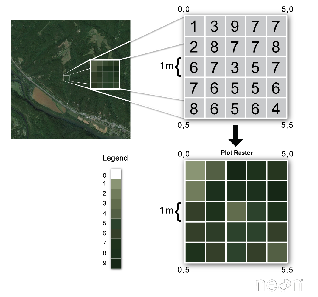
Raster or “gridded” data are stored as a grid of values which are rendered on a map as pixels. Each pixel value represents an area on the Earth’s surface. A raster file is composed of regular grid of cells, all of which are the same size.
-
You’ve looked at and used rasters before if you’ve looked at photographs or imagery in a tool like Google Earth. However, the raster files that you will work with are different from photographs in that they are spatially referenced. Each pixel represents an area of land on the ground. That area is defined by the spatial resolution of the raster.
Raster Facts
A few notes about rasters:
- Each cell is called a pixel.
- And each pixel represents an area on the ground.
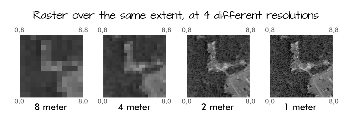
- The resolution of the raster represents the area that each pixel represents on the ground. So, a 1 meter resolution raster, means that each pixel represents a 1 m by 1 m area on the ground.
- A raster dataset can have attributes associated with it as well. For instance in a Lidar derived digital elevation model (DEM), each cell represents an elevation value for that location on the earth. In a LIDAR derived intensity image, each cell represents a Lidar intensity value or the amount of light energy returned to and recorded by the sensor.
3.2 Working with raster in Python
Raster data can be used to store many different types of scientific data including
- elevation data
- canopy height models
- surface temperature
- climate model data outputs
- landuse / landcover data and more…
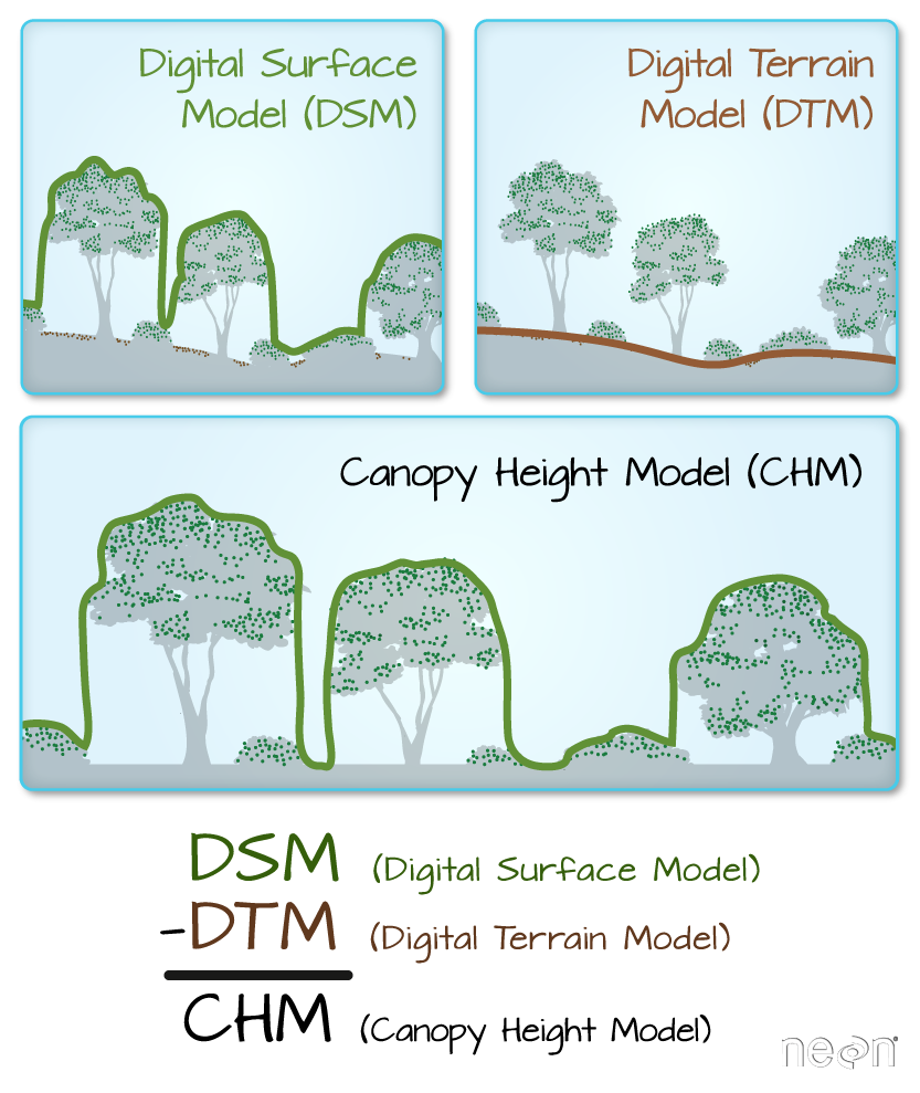
In this lesson you will learn more about working with lidar derived raster data that represents both terrain / elevation data (elevation of the earth’s surface), and surface elevation (elevation at the tops of trees, buildings etc above the earth’s surface).
To begin load the packages that you need to process your raster data.
Import necessary packages
import os

import numpy as np
import matplotlib.pyplot as plt
import seaborn as sns
# Use geopandas for vector data and xarray for raster data
import geopandas as gpd
import rioxarray as rxr

import earthpy as et

# Prettier plotting with seaborn
sns.set(font_scale=1.5, style="white")
Download sample data and set working directory
et.data.get_data("colorado-flood")
os.chdir(os.path.join(et.io.HOME,'earth-analytics'))
dem_pre_path = os.path.join("data","colorado-flood",
                            "spatial",
                            "boulder-leehill-rd",
                            "pre-flood",
                            "lidar",
                            "pre_DTM.tif")

dtm_pre_arr = rxr.open_rasterio(dem_pre_path)
dtm_pre_arr
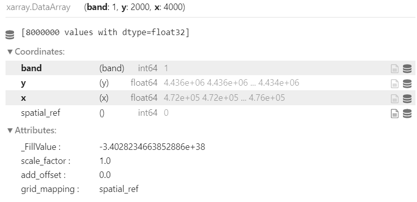
When you open raster data using xarray or rioxarray you are creating an xarray.DataArray. The DataArray object stores the:
- raster data in a numpy array format
- spatial metadata including the CRS, spatial extent of the object
- and any metadata
Xarray and numpy provide an efficient way to work with and process raster data. xarray also supports dask and parallel processing which allows you to more efficiently process larger datasets using the processing power that you have on your computer
When you add rioxarray to your package imports, you further get access to spatial data processing using xarray objects. Below, you can view the spatial extent (bounds()) and CRS of the data that you just opened above.
# View the Coordinate Reference System (CRS) & spatial extent
print("The CRS for this data is:", dtm_pre_arr.rio.crs)
print("The spatial extent is:", dtm_pre_arr.rio.bounds())
The nodata value (or fill value) is also stored in the xarray object.
print("The no data value is:", dtm_pre_arr.rio.nodata)
Once you have imported your data, you can plot is using xarray.plot().
dtm_pre_arr.plot()
plt.show()
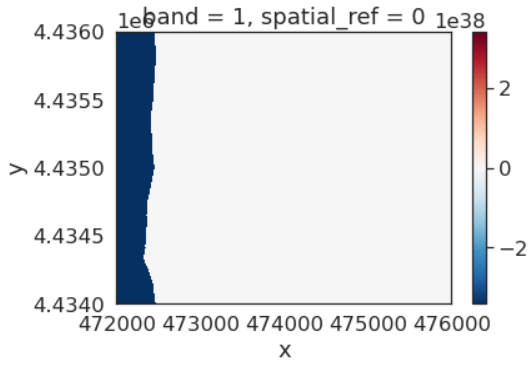
When a plot looks off, it is always a good idea to explore whether nodatavalues exist in your data. Often no data values are very large of negative numbers that are not likely to be valid values in your data. These values will skew any plots (or calculations) in your analysis.
The data above should represent terrain model data. However, the range of values is not what is expected. These data are for Boulder, Colorado where the elevation may range from 1000-3000m. There may be some outlier values in the data that may need to be addressed. Below you look at the distribution of pixel values in the data by plotting a histogram.
Notice that there seem to be a lot of pixel values in the negative range in that plot.
# A histogram can also be helpful to look at the range of values in your data
# What do you notice about the histogram below?
dtm_pre_arr.plot.hist(color="purple")
plt.show()
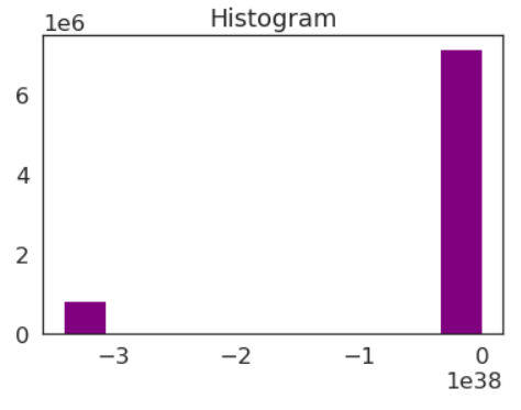
Histogram for your lidar DTM. Notice the number of values that are below 0. This suggests that there may be no data values in the data.
Looking at the min and max values of the data, you can see a very small negative number for the minimum. This number matches the nodata value that you looked at above.
print("the minimum raster value is: ", np.nanmin(dtm_pre_arr.values))
print("the maximum raster value is: ", np.nanmax(dtm_pre_arr.values))
Raster Data Exploration - Min and Max Values
Looking at the minimum value of the data, there is one of two things going on that need to be fixed:
- there may be no data values in the data with a negative value that are skewing your plot colors
- there also could be outlier data in your raster
You can explore the first option - that there are no data values by reading in the data and masking no data values using the masked=True parameter
Above you may have also noticed that the array has an additional dimension for the “band”. While the raster only has one layer - there is a 1 in the output of shape that could get in the way of processing.
You can remove that additional dimension using .squeeze()
# Notice that the shape of this object has a 1 at the beginning that may caused an issue for plotting
dtm_pre_arr.shape

# Open the data and mask no data values
# Squeeze reduces the third dimension given there is only one "band" or layer to this data
dtm_pre_arr = rxr.open_rasterio(dem_pre_path, masked=True).squeeze()
# Notice there are now only 2 dimensions to your array
dtm_pre_arr.shape
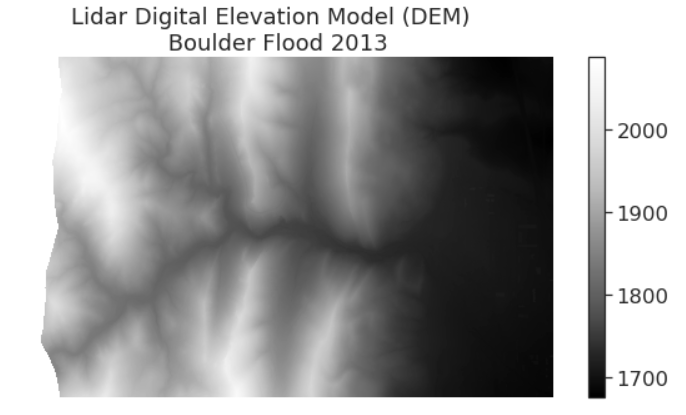
Plot the data again to see what has changed. Now you have a reasonable range of data values and the data plot as you might expect it to.
# Plot the data and notice that the scale bar looks better
# No data values are now masked
f, ax = plt.subplots(figsize=(10, 5))
dtm_pre_arr.plot(cmap="Greys_r",
                 ax=ax)
ax.set_title("Lidar Digital Elevation Model (DEM) \n Boulder Flood 2013")
ax.set_axis_off()
plt.show()
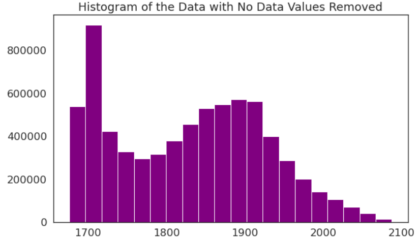
The histogram has also changed. Now, it shows a reasonable distribution of pixel values.
dtm_pre_arr.plot.hist(color="purple",
                      bins=20)
ax.set_title("Histogram of the Data with No Data Values Removed")
plt.show()
Notice that now the minimum value looks more like an elevation value (which should most often not be negative).
print("The minimum raster value is: ", np.nanmin(dtm_pre_arr.data))
print("The maximum raster value is: ", np.nanmax(dtm_pre_arr.data))
3.3 Plot Raster and Vector data together
If you want, you can also add shapefile overlays to your raster data plot. Below you open a single shapefile using Geopandas that contains a boundary layer that you can overlay on top of your raster dataset
# Open site boundary vector layer
site_bound_path = "data/colorado-flood/spatial/boulder-leehill-rd/clip-extent.shp"

site_bound_shp = gpd.read_file(site_bound_path)

# Plot the vector data
f, ax = plt.subplots(figsize=(8,4))
site_bound_shp.plot(color='teal',
                    edgecolor='black',
                    ax=ax)
ax.set(title="Site Boundary Layer - Shapefile")
plt.show()
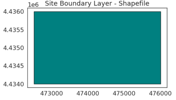
Once you have your shapefile open, can plot the two datasets together and begin to create a map.
f, ax = plt.subplots(figsize=(11, 4))

dtm_pre_arr.plot.imshow(cmap="Greys",
                        ax=ax)
site_bound_shp.plot(color='None',
                    edgecolor='teal',
                    linewidth=2,
                    ax=ax,
                    zorder=4)

ax.set(title="Raster Layer with Vector Overlay")
ax.axis('off')
plt.show()
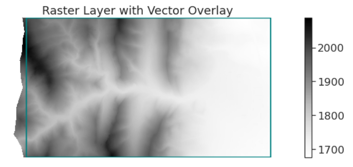
You now have the basic skills needed to open and plot raster data using rioxarray and xarray. In the following lessons, you will learn more about exploring and processing raster data.
3.4 Raster Metadata
Coordinate Reference System (CRS)
The Coordinate Reference System or CRS of a spatial object tells Python where the raster is located in geographic space. It also tells Python what mathematical method should be used to “flatten” or project the raster in geographic space.
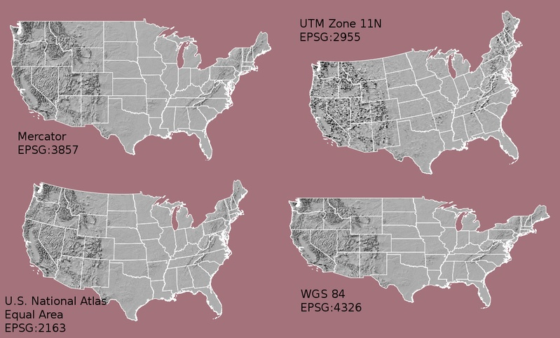 Maps of the United States in different projections. Notice the differences in shape associated with each different projection. These differences are a direct result of the calculations used to “flatten” the data onto a 2-dimensional map. Source: M. Corey, opennews.org
Note: data from the same location but saved in different coordinate references systems will not line up in any GIS or other program.
You can view the CRS using crs() method in Python
# Import necessary packages
import os

import matplotlib.pyplot as plt
import rioxarray as rxr
import earthpy as et

# Get data and set working directory
et.data.get_data("colorado-flood")
os.chdir(os.path.join(et.io.HOME,
                      'earth-analytics',
                      'data'))

# Define relative path to file
lidar_dem_path = "colorado-flood/spatial/boulder-leehill-rd/pre-flood/lidar/pre_DTM.tif"

# View crs of raster imported with rasterio
lidar_dem = rxr.open_rasterio(lidar_dem_path, masked=True)
print("The CRS of this data is:", lidar_dem.rio.crs)
The CRS object is 32613 which you can look up on the spatial reference.org website
Raster Extent
The spatial extent of a raster or spatial object is the geographic area that the raster data covers.
lidar_dem.rio.bounds()
Raster Resolution
A raster has horizontal (x and y) resolution. This resolution represents the area on the ground that each pixel covers. The units for your data are in meters as determined by the CRS above. In this case, your data resolution is 1 x 1. This means that each pixel represents a 1 x 1 meter area on the ground. You can view the resolution of your data using the .res function.
lidar_dem.rio.resolution()
3.5 Raster processing
Subtracting Raster
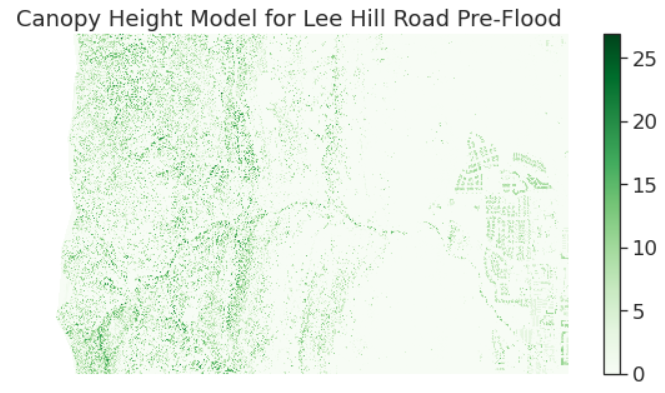
Canopy Height Model: represents the HEIGHT of the trees. This is not an elevation value, rather it’s the height or distance between the ground and the top of the trees (or buildings or whatever object that the lidar system detected and recorded).
Some canopy height models also include buildings, so you need to look closely at your data to make sure it was properly cleaned before assuming it represents all trees!
CHM = DSM - DEM
Code to subtract 2 rasters:
# Load DTM and DSM rasters:
pre_flood_path = "data/colorado-flood/spatial/boulder-leehill-rd/pre-flood/lidar/"
pre_DTM = rxr.open_rasterio(pre_flood_path+"pre_DTM.tif",masked=True).squeeze()
pre_DSM = rxr.open_rasterio(pre_flood_path+"pre_DSM.tif",masked=True).squeeze()

# Check if DTM and DSM have the same spatial extend and resolution?
print("Is the spatial extent the same?",
      pre_DTM.rio.bounds() == pre_DSM.rio.bounds())

# Is the resolution the same ??
print("Is the resolution the same?",
      pre_DTM.rio.resolution() == pre_DSM.rio.resolution())
# Calculate canopy height model
CHM = pre_DSM - pre_DTM

# Plot the data
f, ax = plt.subplots(figsize=(10, 5))
CHM.plot(cmap="Greens")
ax.set(title="Canopy Height Model for Lee Hill Road Pre-Flood")
ax.set_axis_off()
plt.show()
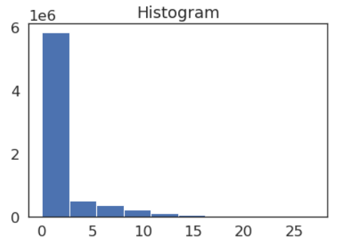
Explore the histogram to see the range of raster values
CHM.plot.hist()
plt.show()
Export CHR to geotiff format
CHM.rio.to_raster(pre_flood_path+"CHR.tif")
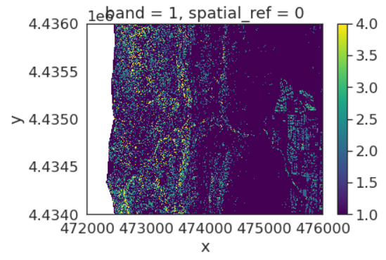
Spatial plot with masked value above 5
import xarray as xr
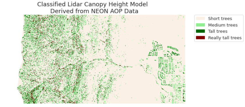
class_bins = [-np.inf, 2, 7, 12, np.inf]
CHM_class = xr.apply_ufunc(np.digitize,CHM,class_bins)

# Mask out values not equalt to 5
CHM_class_ma = CHM_class.where(CHM_class != 5)

im = CHM_class_ma.plot.imshow()
ax.set_axis_off()
Using legend:
from matplotlib.colors import ListedColormap, BoundaryNorm
import earthpy.plot as ep
# Create a list of labels to use for your legend
height_class_labels = ["Short trees",
                       "Medium trees",
                       "Tall trees",
                       "Really tall trees"]

# Create a colormap from a list of colors
colors = ['linen',
          'lightgreen',
          'darkgreen',
          'maroon']

cmap = ListedColormap(colors)

class_bins = [.5, 1.5, 2.5, 3.5, 4.5]
norm = BoundaryNorm(class_bins,
                    len(colors))

# Plot newly classified and masked raster
f, ax = plt.subplots(figsize=(10, 5))
im = CHM_class_ma.plot.imshow(cmap=cmap,
                                        norm=norm,
                                        # Turn off colorbar
                                        add_colorbar=False)
# Add legend using earthpy
ep.draw_legend(im,
               titles=height_class_labels)
ax.set(title="Classified Lidar Canopy Height Model \n Derived from NEON AOP Data")
ax.set_axis_off()
plt.show()
Clipping raster
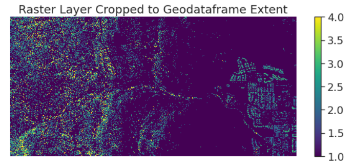
We and clip raster using clip() function. Here we clip the raster data using shapefile
Load the vector data:
shp_path = "data/colorado-flood/spatial/boulder-leehill-rd/"

# Open crop extent (your study area extent boundary)
crop_extent = gpd.read_file(shp_path+"clip-extent.shp")
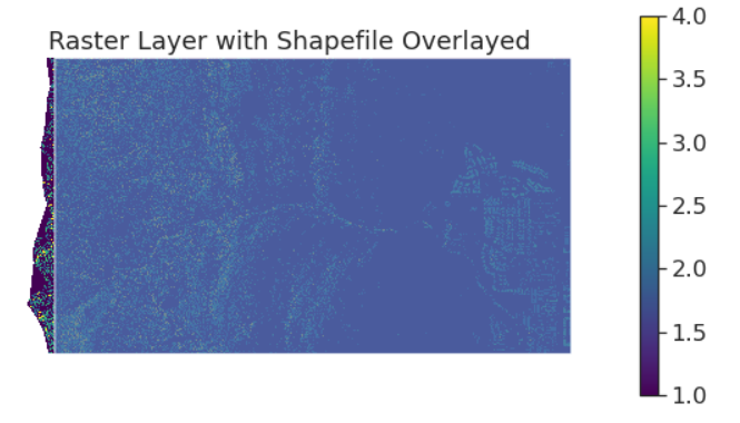
Impose the shapefile over to raster
f, ax = plt.subplots(figsize=(10, 5))
CHM_class_ma.plot.imshow(ax=ax)

crop_extent.plot(ax=ax,
                 alpha=.8)
ax.set(title="Raster Layer with Shapefile Overlayed")

ax.set_axis_off()
plt.show()
Cliping
from shapely.geometry import mapping

CHM_clipped = CHM_class_ma.rio.clip(crop_extent.geometry.apply(mapping),
                                      # This is needed if your GDF is in a diff CRS than the raster data
                                      crop_extent.crs)

f, ax = plt.subplots(figsize=(10, 4))
CHM_clipped.plot(ax=ax)
ax.set(title="Raster Layer Cropped to Geodataframe Extent")
ax.set_axis_off()
plt.show()
3.6 Extract point data from raster
Load raster:
sjer_lidar_chm_path = os.path.join("data",
                                   "spatial-vector-lidar",
                                   "california",
                                   "neon-sjer-site",
                                   "2013",
                                   "lidar")

sjer_chm = rxr.open_rasterio(sjer_lidar_chm_path+"/SJER_lidarCHM.tif", masked=True).squeeze()
Load shapefile:
vector_path = os.path.join("data",
                           "spatial-vector-lidar",
                           "california",
                           "neon-sjer-site",
                           "vector_data")

sjer_plots_points = gpd.read_file(vector_path+"/SJER_plot_centroids.shp")
Plotting overlay
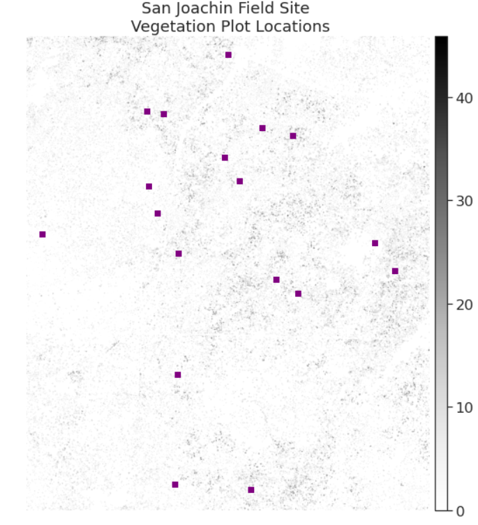
fig, ax = plt.subplots(figsize=(10, 10))

# We plot with the zeros in the data so the CHM can be better represented visually
ep.plot_bands(sjer_chm,
              extent=plotting_extent(sjer_chm,
                                     sjer_chm.rio.transform()),  # Set spatial extent
              cmap='Greys',
              title="San Joachin Field Site \n Vegetation Plot Locations",
              scale=False,
              ax=ax)

sjer_plots_points.plot(ax=ax,
                       marker='s',
                       #markersize=45,
                       color='purple')
ax.set_axis_off()
plt.show()
Clean up the 0 value
# CLEANUP: Set CHM values of 0 to NAN (no data or not a number)
sjer_chm_data_no_zeros = sjer_chm_data.where(sjer_chm_data != 0, np.nan)
# Create a buffered polygon layer from your plot location points
sjer_plots_poly = sjer_plots_points.copy()

# Buffer each point using a 20 meter circle radius
# and replace the point geometry with the new buffered geometry
sjer_plots_poly["geometry"] = sjer_plots_points.geometry.buffer(20)
sjer_plots_poly.head()
plot_buffer_path = os.path.join("data",
                                   "spatial-vector-lidar",
                                   "california",
                                   "neon-sjer-site",
                                   "plot_buffer.shp")

sjer_plots_poly.to_file(plot_buffer_path)
Extract
import rasterstats as rs

# Extract zonal stats
sjer_tree_heights = rs.zonal_stats(plot_buffer_path,
                                   sjer_chm_no_zeros.values,
                                   nodata=-999,
                                   affine=sjer_chm_no_zeros.rio.transform(),
                                   geojson_out=True,
                                   copy_properties=True,
                                   stats="count min mean max median")

# Turn extracted data into a pandas geodataframe
sjer_lidar_height_df = gpd.GeoDataFrame.from_features(sjer_tree_heights)
sjer_lidar_height_df.head()
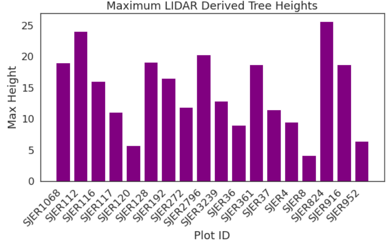
Plot
fig, ax = plt.subplots(figsize=(10, 5))

ax.bar(sjer_lidar_height_df['Plot_ID'],
       sjer_lidar_height_df['max'],
       color="purple")

ax.set(xlabel='Plot ID',
       ylabel='Max Height',
       title='Maximum LIDAR Derived Tree Heights')

plt.setp(ax.get_xticklabels(), rotation=45, horizontalalignment='right')
plt.show()
Key Points
raster
Multispectral Remote Sensing Data
Overview
Teaching: 20 min
Exercises: 0 minQuestions
How do we work with multispectral Remote Sensing data
Objectives
Open and do analyses with multispectral Remote Sensing data
4 Multispectral Remote Sensing data
Earlier in this course, you worked with raster data derived from lidar remote sensing instruments. These rasters consisted of one layer or band and contained height values derived from lidar data. In this lesson, you will learn how to work with rasters containing multispectral imagery data stored within multiple bands (or layers).
4.1 Key Attributes of Spectral Remote Sensing Data
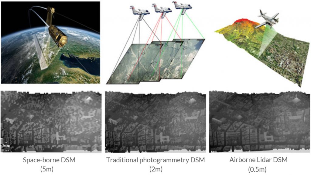
Space vs Airborne data
- Remote sensing data can be collected from the ground, the air (using airplanes or helicopters) or from spac
- You can imagine that data that are collected from space are often of a lower spatial resolution than data collected from an airplane.
- For example the Landsat 8 satellite has a 16 day repeat cycle for the entire globe. This means that you can find a new image for an area, every 16 days. It takes a lot of time and financial resources to collect airborne data.
Bands and Wavelengths
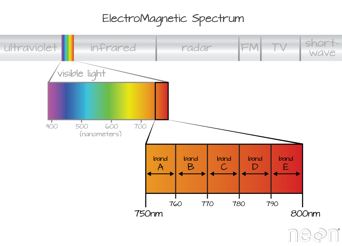
Band
- A band represents a segment of the electromagnetic spectrum
- For example, the wavelength values between 800 nanometers (nm) and 850 nm might be one band captured by an imaging spectrometer.
- Often when you work with a multispectral dataset, the band information is reported as the center wavelength value.
Spectral Resolution
The spectral resolution of a dataset that has more than one band, refers to the spectral width of each band in the dataset. In the image above, a band was defined as spanning 800-810 nm. The spectral width or spectral resolution of the band is thus 10 nm.
Spatial Resolution
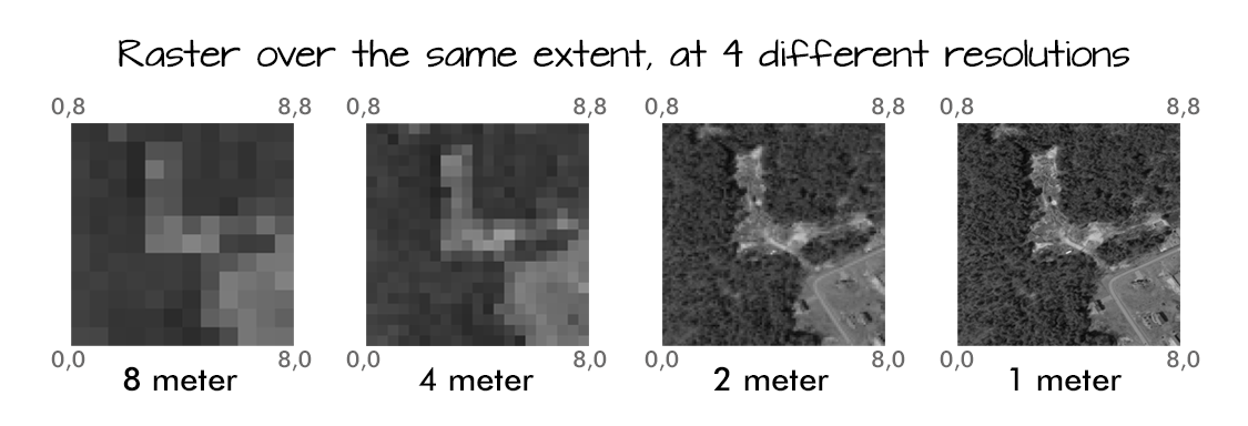
The spatial resolution of a raster represents the area on the ground that each pixel covers
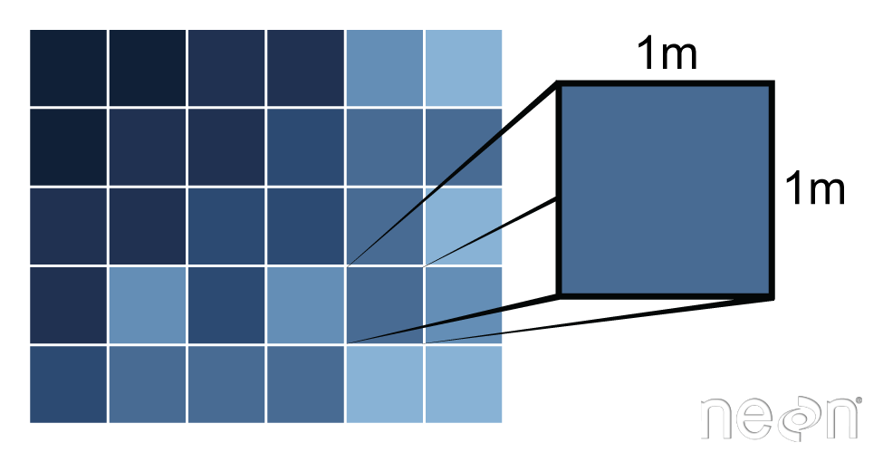
The spatial resolution of a raster represents the area on the ground that each pixel covers. Source: Colin Williams, NEON.
4.2 Multispectral data processing with python
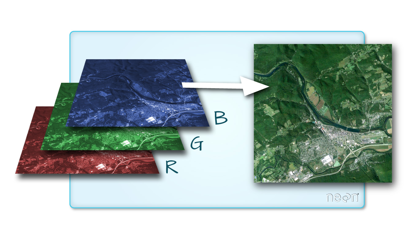
Some functions:
- rasterio.open function: similar to opening raster data, this function from xarray is used to open multi-band raster data
- stack function: import multi-band raster data
- plot_rgb function from earthpy is used again to plot the composite into a color image
4.3 Working with Landsat data
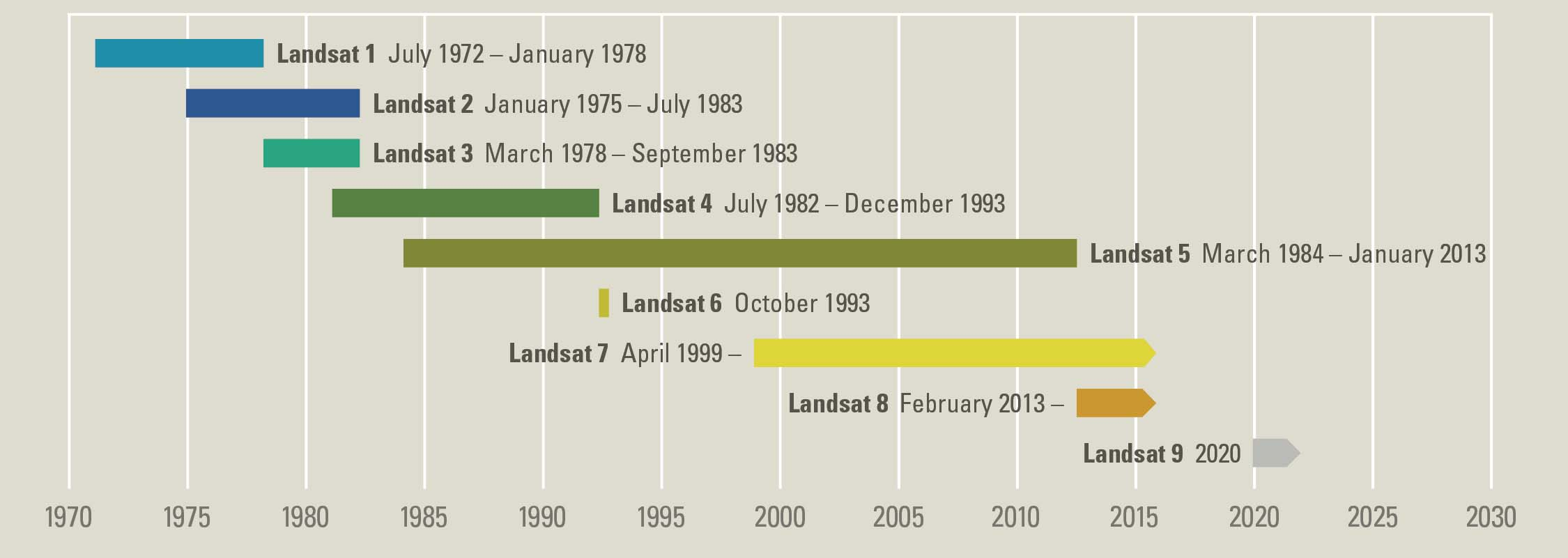
At over 40 years, the Landsat series of satellites provides the longest temporal record of moderate resolution multispectral data of the Earth’s surface on a global basis. The Landsat record has remained remarkably unbroken, proving a unique resource to assist a broad range of specialists in managing the world’s food, water, forests, and other natural resources for a growing world population. It is a record unmatched in quality, detail, coverage, and value. Source: USGS
Importing Landsat data
import os
from glob import glob

import matplotlib.pyplot as plt
import numpy as np
import geopandas as gpd
import xarray as xr
import rioxarray as rxr
import earthpy as et
import earthpy.spatial as es
import earthpy.plot as ep

# Download data and set working directory
data = et.data.get_data("cold-springs-fire")
os.chdir(os.path.join(et.io.HOME,
                      "earth-analytics",
                      "data"))
Get list of all pre-cropped data and sort the data
# Create the path to your data
landsat_post_fire_path = os.path.join("cold-springs-fire",
                                      "landsat_collect",
                                      "LC080340322016072301T1-SC20180214145802",
                                      "crop")

# Generate a list of tif files
post_fire_paths = glob(os.path.join(landsat_post_fire_path,
                                        "*band*.tif"))

# Sort the data to ensure bands are in the correct order
post_fire_paths.sort()
post_fire_paths
Open a single band from your Landsat scene.
Below you use the .squeeze() method to ensure that output xarray object only has 2 dimensions and not three.
band_1 = rxr.open_rasterio(post_fire_paths[0], masked=True).squeeze()
band_1.shape
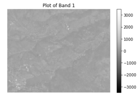
Plotting band 1
f, ax=plt.subplots()
band_1.plot.imshow(ax=ax,
                  cmap="Greys_r")
ax.set_axis_off()
ax.set_title("Plot of Band 1")
plt.show()
Creating a loop process to import multispectral images
def open_clean_bands(band_path):
    return rxr.open_rasterio(band_path, masked=True).squeeze()

# Open all bands in a loop
all_bands = []
for i, aband in enumerate(post_fire_paths):
    all_bands.append(open_clean_bands(aband))
    # Assign a band number to the new xarray object
    all_bands[i]["band"]=i+1

# OPTIONAL: Turn list of bands into a single xarray object
landsat_post_fire_xr = xr.concat(all_bands, dim="band")
landsat_post_fire_xr.shape
Plot this multispectral images using plot_rgb function from earthpy
ep.plot_rgb(landsat_post_fire_xr.values,
            rgb=[3, 2, 1],
            title="Landsat RGB Image\n Linear Stretch Applied",
            stretch=True,
            str_clip=1)
plt.show()

# Tip: adjust the str_clip
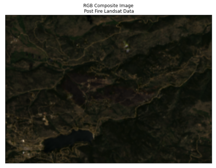
4.4 MODIS
Moderate Resolution Imaging Spectrometer (MODIS) is a satellite-based instrument that continuously collects data over the Earth’s surface. Currently, MODIS has the finest temporal resolution of the publicly available remote sensing data, spanning the entire globe every 24 hrs.
MODIS collects data across 36 spectral bands; however, in this class, you will only work with the first 7 bands.
Import data
Here we use the same data set but with different modis layer:
# Create list of MODIS rasters for surface reflectance
modis_bands_pre_list = glob(os.path.join("cold-springs-fire",
                                         "modis",
                                         "reflectance",
                                         "07_july_2016",
                                         "crop",
                                         "*_sur_refl_b*.tif"))

# Sort the list of bands
modis_bands_pre_list.sort()
modis_bands_pre_list
Combine 7 bands from MODIS
def combine_tifs(tif_list):
    out_xr = []

    for i, tif_path in enumerate(tif_list):
        out_xr.append(rxr.open_rasterio(tif_path, masked=True).squeeze())
        out_xr[i]["band"] = i+1

    return xr.concat(out_xr, dim="band")

modis_bands_pre = combine_tifs(modis_bands_pre_list)
Plotting MODIS data using plot_rgb from earthpy
ep.plot_rgb(modis_bands_pre.values,
            rgb=[0, 3, 2],
            title="Surface Reflectance \n MODIS RGB Bands")
plt.show()
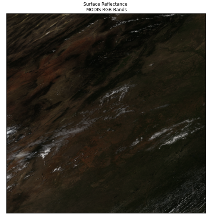
Explore the dataset
To start exploring the data, you can calculate the minimum and maximum values of select bands to see the range of values. For example, you can calculate these values for the first band (red) of the MODIS stack.
# Identify minimum and maximum values of band 1 (red)
print(modis_bands_pre[1].min(), modis_bands_pre[1].max())
Key Points
Multispectral, Remote Sensing
Network Common Data Format
Overview
Teaching: 20 min
Exercises: 0 minQuestions
How to train a Machine Learning model with continuos output
Objectives
Learn to use different ML algorithm for Supervised Learning
5 Network common data NetCDF format
5.1 What is NetCDF?
NetCDF (network Common Data Form) is a hierarchical data format . It is what is known as a “self-describing” data structure which means that metadata, or descriptions of the data, are included in the file itself and can be parsed programmatically, meaning that they can be accessed using code to build automated and reproducible workflows.
The NetCDF format can store data with multiple dimensions. It can also store different types of data through arrays that can contain geospatial imagery, rasters, terrain data, climate data, and text. These arrays support metadata, making the netCDF format highly flexible. NetCDF was developed and is supported by UCAR who maintains standards and software that support the use of the format.
It is perfect to store Climate data with x and y values representing latitude and longitude location for a point or a grid cell location on the earth’s surface and time.
5.2 Tools to work with NetCDF data
Python also has several open source tools that are useful for processing netcdf files including:
- Xarray: one of the most common tools used to process netcdf data. Xarray knows how to open netcdf 4 files automatically giving you access to the data and metadata in spatial formats.
- rioxarray: a wrapper that adds spatial functionality such as reproject and export to geotiff to xarray objects.
- Regionmask: regionmask builds on top of xarray to support spatial subsetting and AOIs for xarray objects.
5.3 NetCDF in Python
Loading library
import os

import numpy as np
import pandas as pd
import matplotlib.pyplot as plt

# netCDF4 needs to be installed in your environment for this to work
import xarray as xr
import rioxarray as rxr
import seaborn as sns
import geopandas as gpd
import earthpy as et

# Optional - set your working directory if you wish to use the data
# accessed lower down in this notebook (the USA state boundary data)
os.chdir(os.path.join(et.io.HOME,
                      'earth-analytics',
                      'data'))
In this lesson you will work with historic temperature data that represents air temperature for the Continental United States (CONUS).
Open up the data online
# The (online) url for a MACAv2 dataset for max monthly temperature
data_path = "tmax.nc"

tmx  = xr.open_dataset(data_path)
# View xarray object
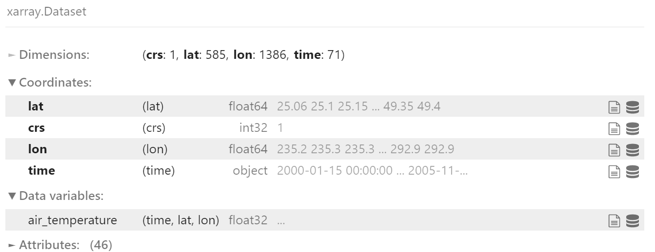
tmx
Dimensions, Variables, Attributes
From the above output, we see there are 4 Dimensions (crs: 1,lat: 585,lon: 1386,time: 71) in NetCDF file and 1 Data variable (air_temperature).
We can get the variable using the following commands:
tmx.air_temperature
# or
tmx["air_temperature"]
Next, Let’s convert temperature unit from Kelvin to Celcius
# Convert from K to C
Tc = tmx.air_temperature-273.15

# Copy attributes to get nice figure lables
Tc.attrs = tmx.air_temperature.attrs
Tc.attrs["units"]="degC"
Getting temperature from your location
Getting your location
!pip install geocoder
import geocoder
myloc = geocoder.ip('me')
my_lat,my_lon=myloc.latlng

# Convert longitude to the same longitude as NetCDF file:
my_lon =my_lon+360

print(my_lat,my_lon)
Getting the closest index to your lat/lon
indx_lat=abs((Tc.lat-my_lat)).argmin()
indx_lon=abs((Tc.lon-my_lon)).argmin()
Extract temperature data near to your location
my_tmp = Tc.isel(lat=indx_lat,lon=indx_lon)
my_tmp.plot()
Note:
- isel: index select
- sel: select any nearest value or range of value via slicing
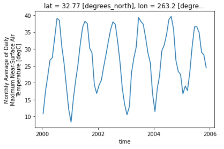
You can make the plot a bit prettier if you’d like using the standard Python matplotlib plot parameters. Below you change the marker color to purple and the lines to grey. figsize is used to adjust the size of the plot.
# You can clean up your plot as you wish using standard matplotlib approaches
f, ax = plt.subplots(figsize=(12, 6))
my_tmp.plot.line(hue='lat',
                    marker="o",
                    ax=ax,
                    color="grey",
                    markerfacecolor="purple",
                    markeredgecolor="purple")
ax.set(title="Time Series For a My Lat / Lon Location")
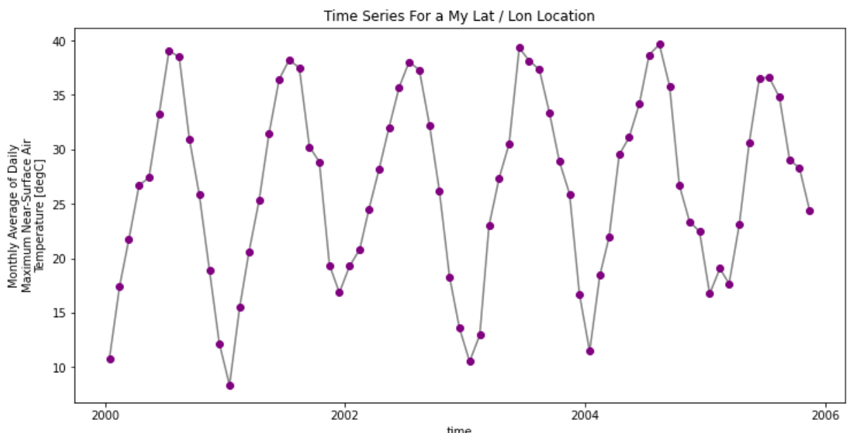
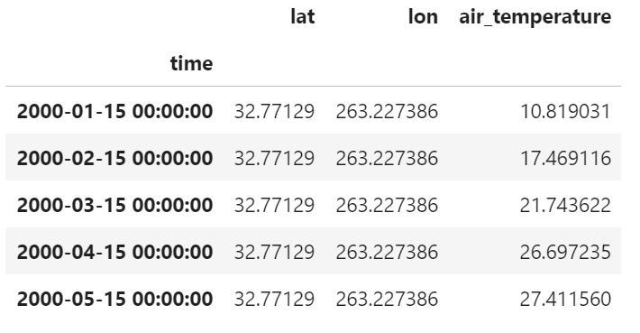
For more convinient using pandas, you can export xarray dataframe to pandas format and/or to csv:
# Convert to dataframe -- then this can easily be exported to a csv
my_tmp_df = my_tmp.to_dataframe()
# View just the first 5 rows of the data
my_tmp_df.head()
Plotting 2D map
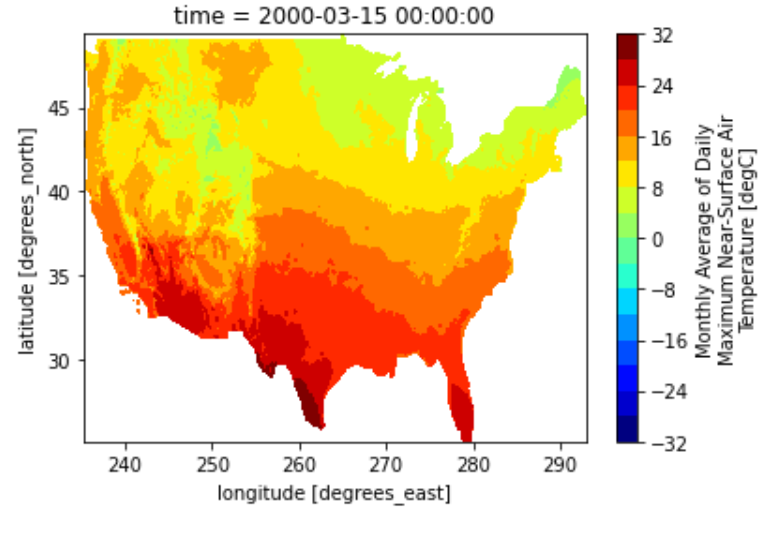
We can plot the 2D map of NetCDF with fixed time index
air2d = Tc.isel(time=2)
air2d.plot()
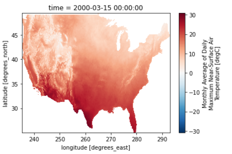
We can change the colormap as well as the number of temperature level
air2d.plot(levels=20,cmap="jet")
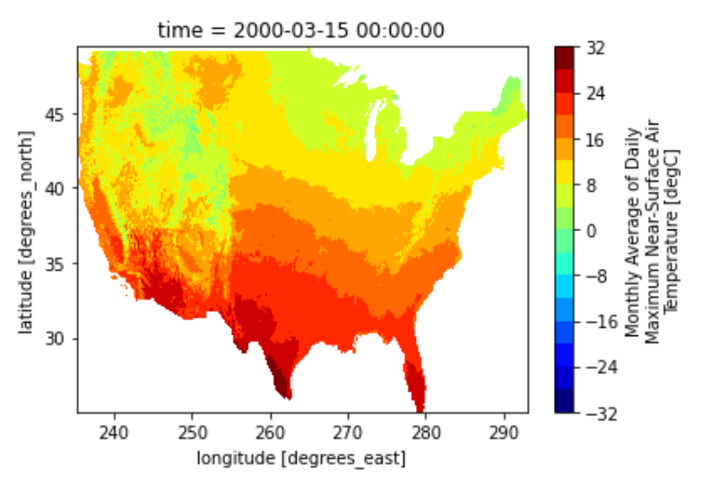
We can also smooth the pixelated map using contourf
air2d.plot.contourf(levels=20,cmap="jet")
5.4 Cropping NetCDF with shapefile
Load shapefile
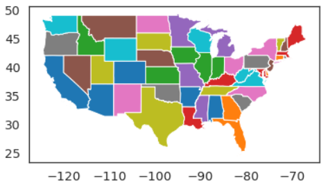
First, let open up the USA shapefile:
# Load usa shapefile
path = "/users/tuev/earth-analytics/data/spatial-vector-lidar/usa/"
usa_shp = gpd.read_file(path+"usa-states-census-2014.shp")
usa_shp.plot(column="NAME")
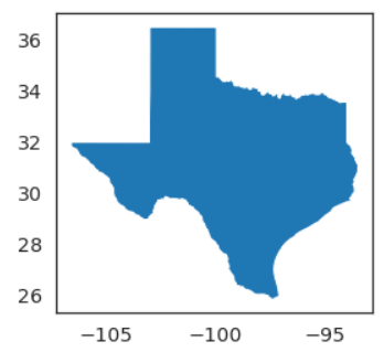
Select Texas state from 48 CONUS states:
TX_shp = usa_shp[usa_shp["NAME"]=="Texas"]
TX_shp.plot(column="NAME")
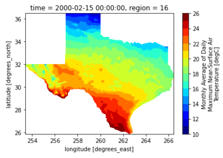
Create Texas mask from its shapefile and having the same resolution as max_temp_xr
import regionmask
TX_mask = regionmask.mask_3D_geopandas(TX_shp,
                                       air2d.lon,
                                       air2d.lat).squeeze()

TX_air_temp = Tc.where(TX_mask)
Plotting TX temperature at selected time scale
lon_min,lat_min,lon_max,lat_max = TX_shp.total_bounds
Tsel = TX_air_temp.sel(time='2000-02-15 00:00:00',
                lon =slice(lon_min+360,lon_max+360),
                lat =slice(lat_min,lat_max)).squeeze()
Tsel.plot.contourf(levels=20,cmap='jet')
Key Points
Supervised Learning with continuous output
Other method of plotting with Geospatial data
Overview
Teaching: 20 min
Exercises: 0 minQuestions
How to train a Machine Learning model with Categorical output?
Objectives
Learn different ML Supervised Learning with Categorical output
6 Other libraries for Geospatial data analytics
6.1 Folium
Folium builds on the data wrangling strengths of the Python ecosystem and the mapping strengths of the leaflet.js library. Manipulate your data in Python, then visualize it in on a Leaflet map via folium.
folium makes it easy to visualize data that’s been manipulated in Python on an interactive leaflet map. It enables both the binding of data to a map for choropleth visualizations as well as passing rich vector/raster/HTML visualizations as markers on the map.
The library has a number of built-in tilesets from OpenStreetMap, Mapbox, and Stamen, and supports custom tilesets with Mapbox or Cloudmade API keys. folium supports both Image, Video, GeoJSON and TopoJSON overlays.
Contents
Install
pip install folium
Basemap
Get your current location
import geocoder
myloc = geocoder.ip('me')
my_lat,my_lon=myloc.latlng
Plotting regular map
#Regular map
map = folium.Map(location=[my_lat,my_lon])
map
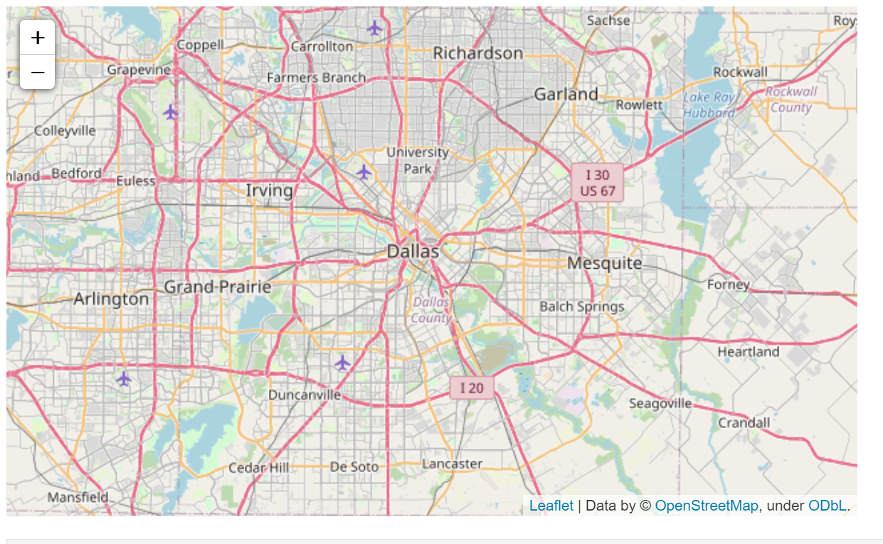
Zooming in
#Regular map
map = folium.Map(location=[my_lat,my_lon], zoom_start=15)
map
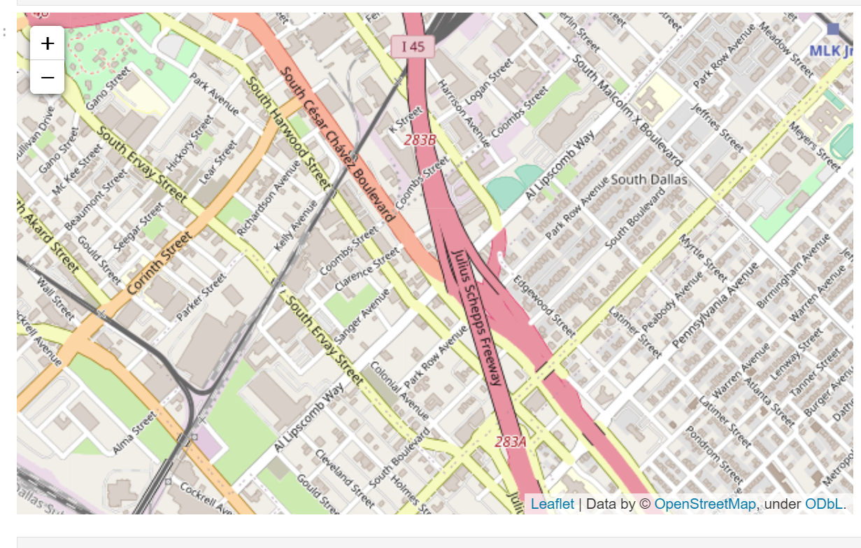
Stamen Terrain
map = folium.Map(location = [my_lat,my_lon], tiles = "Stamen Terrain", zoom_start = 9)
map
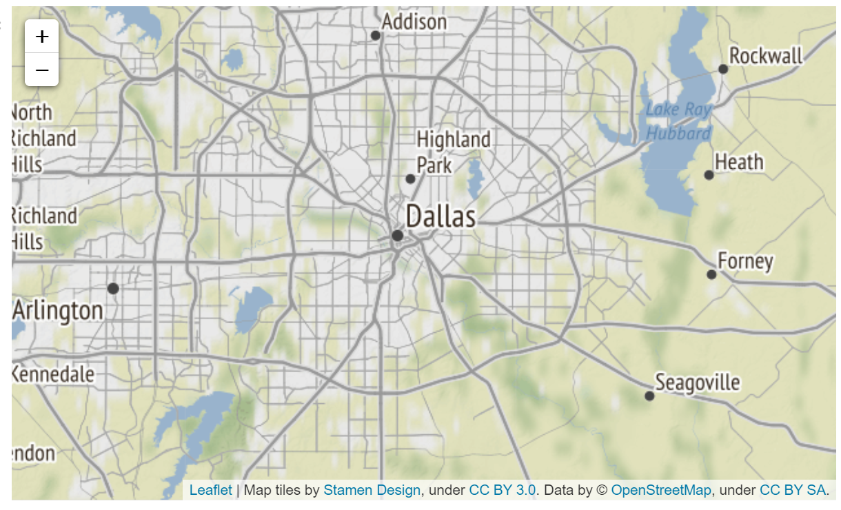
OpenStreetMap
map = folium.Map(location = [my_lat,my_lon], tiles='OpenStreetMap' , zoom_start = 10)
map
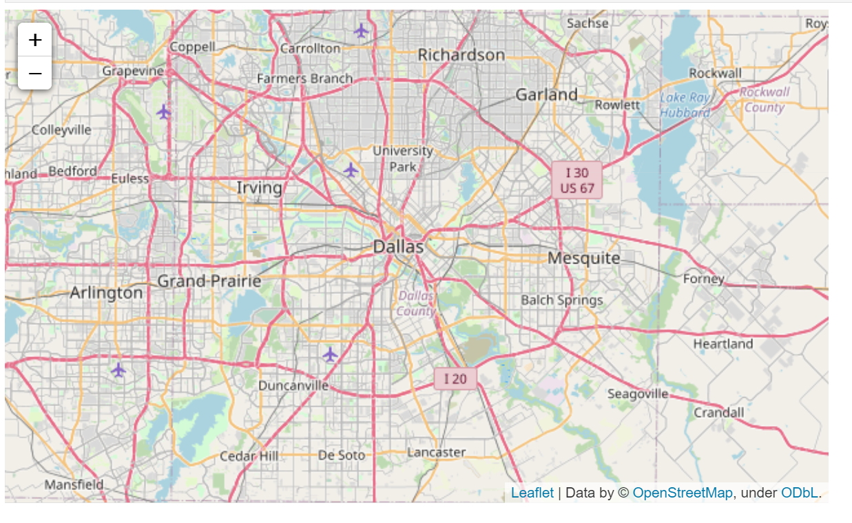
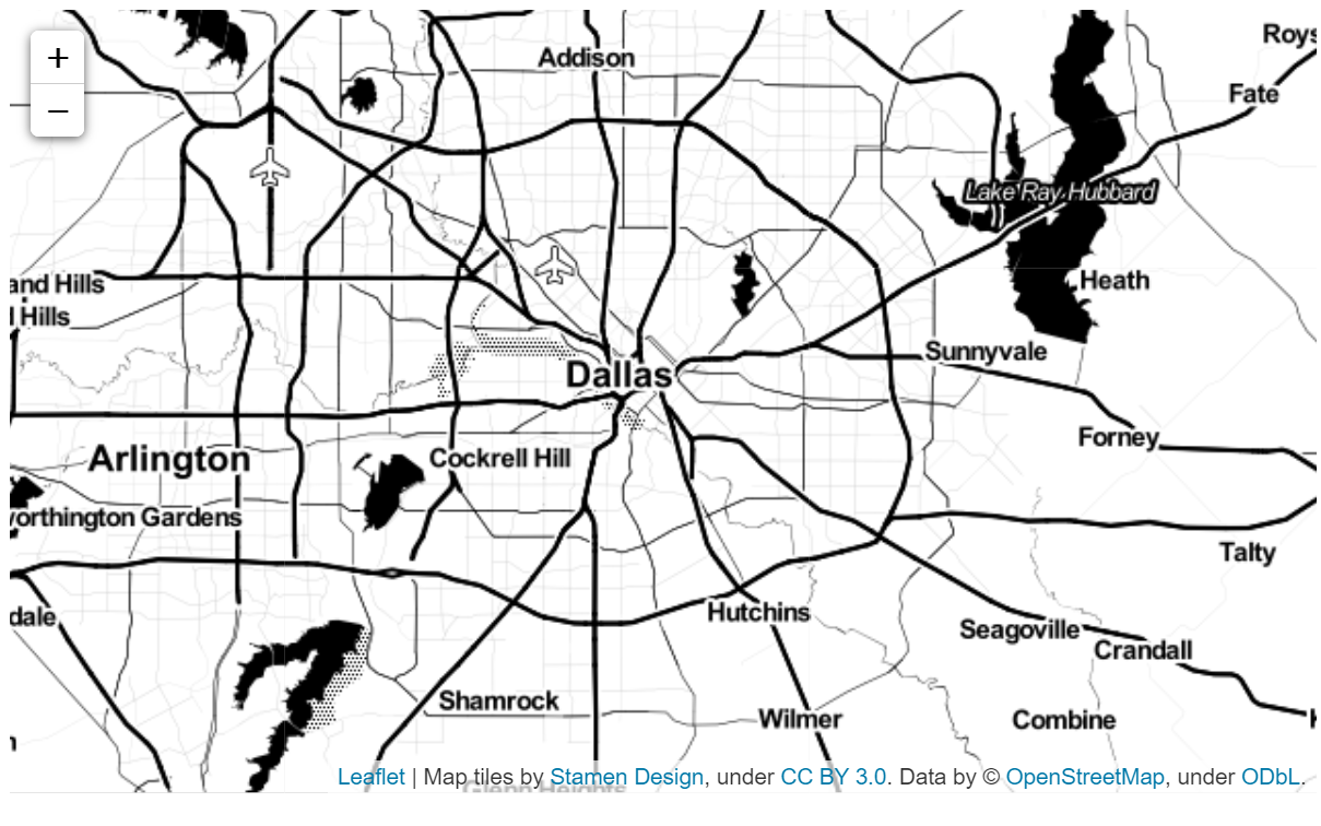
Stamen Toner
map = folium.Map(location = [my_lat,my_lon], tiles='Stamen Toner', zoom_start = 10)
map
Plotting with Markers
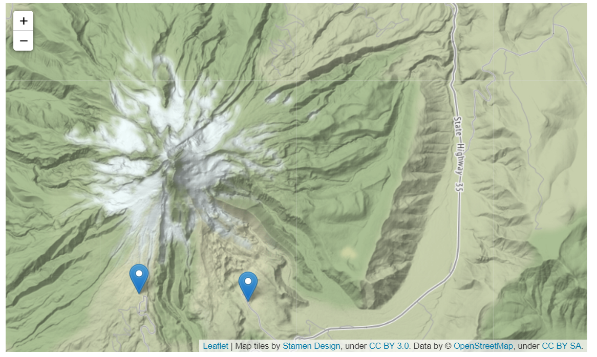
m = folium.Map(location=[45.372, -121.6972], zoom_start=12, tiles="Stamen Terrain")

tooltip = "Click me!"

folium.Marker(
    [45.3288, -121.6625], popup="<i>Mt. Hood Meadows</i>", tooltip=tooltip
).add_to(m)
folium.Marker(
    [45.3311, -121.7113], popup="<b>Timberline Lodge</b>", tooltip=tooltip
).add_to(m)

m
More information on using folium
Key Points
Folium